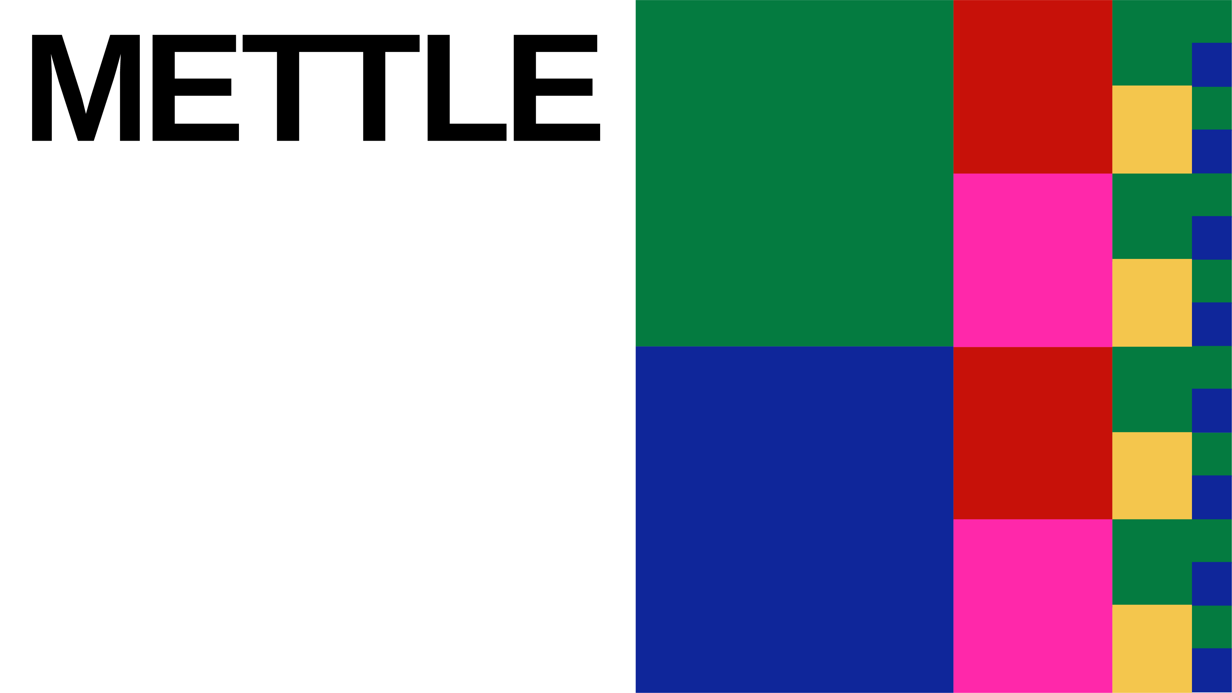
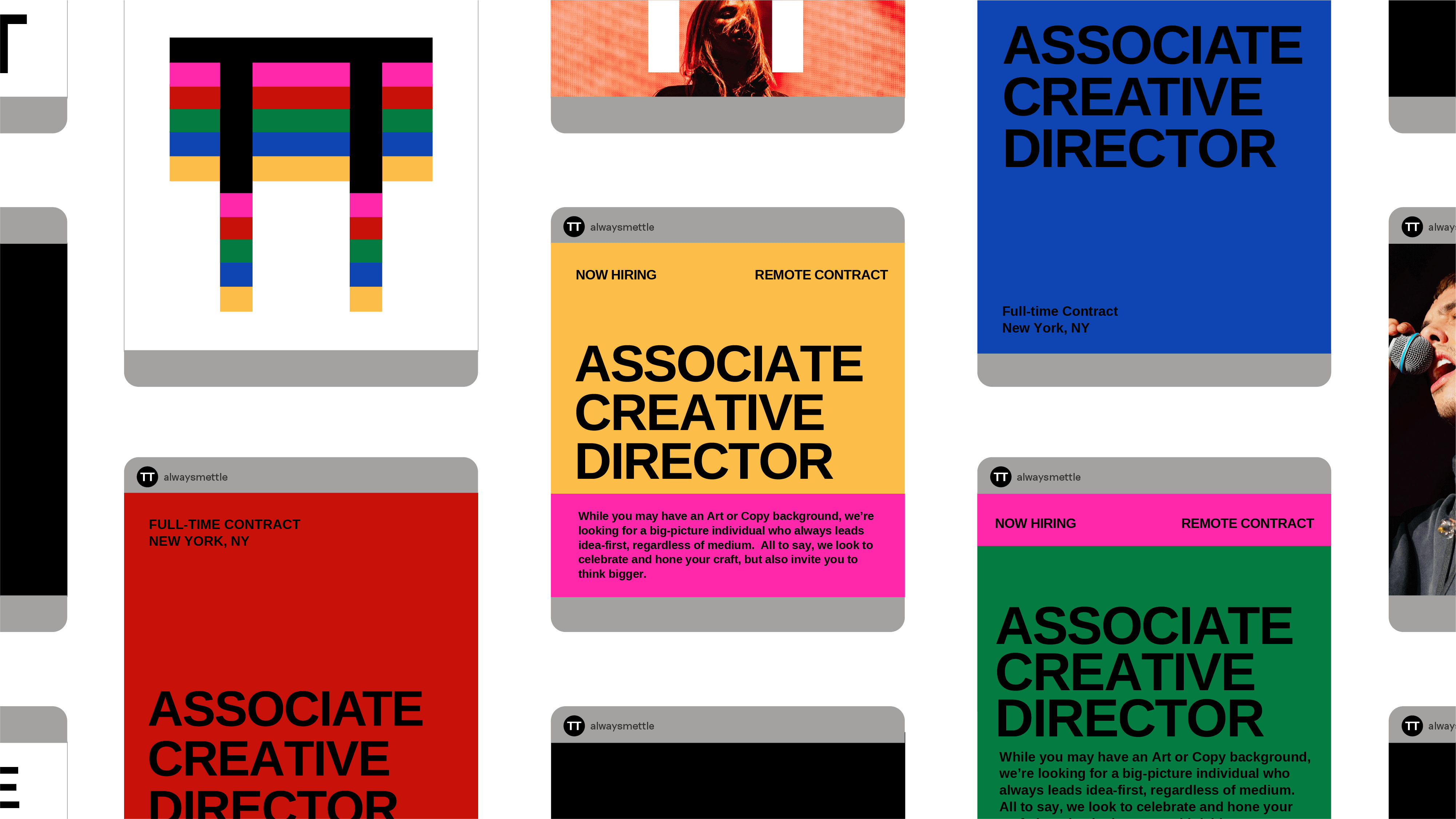
Mettle

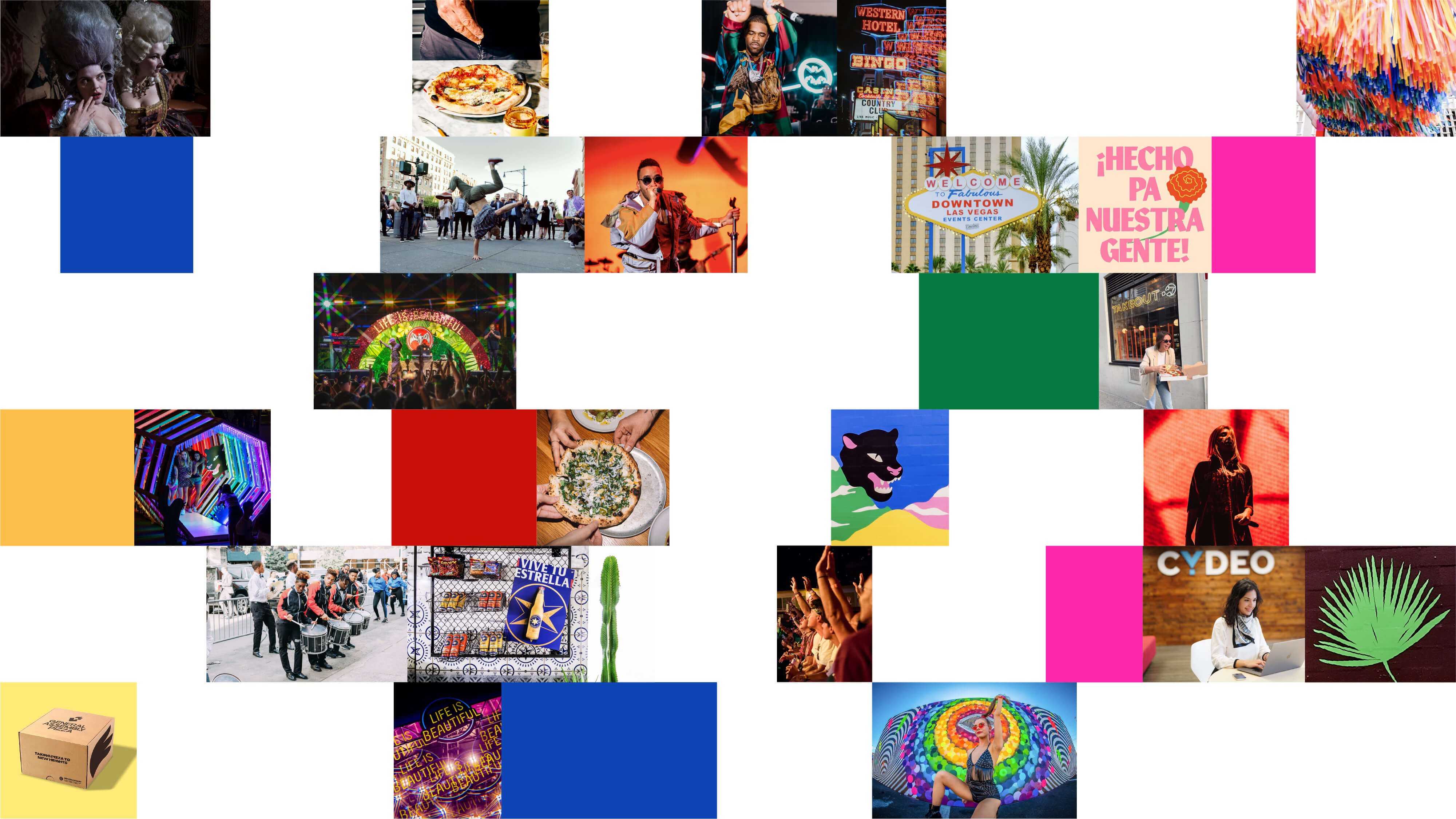


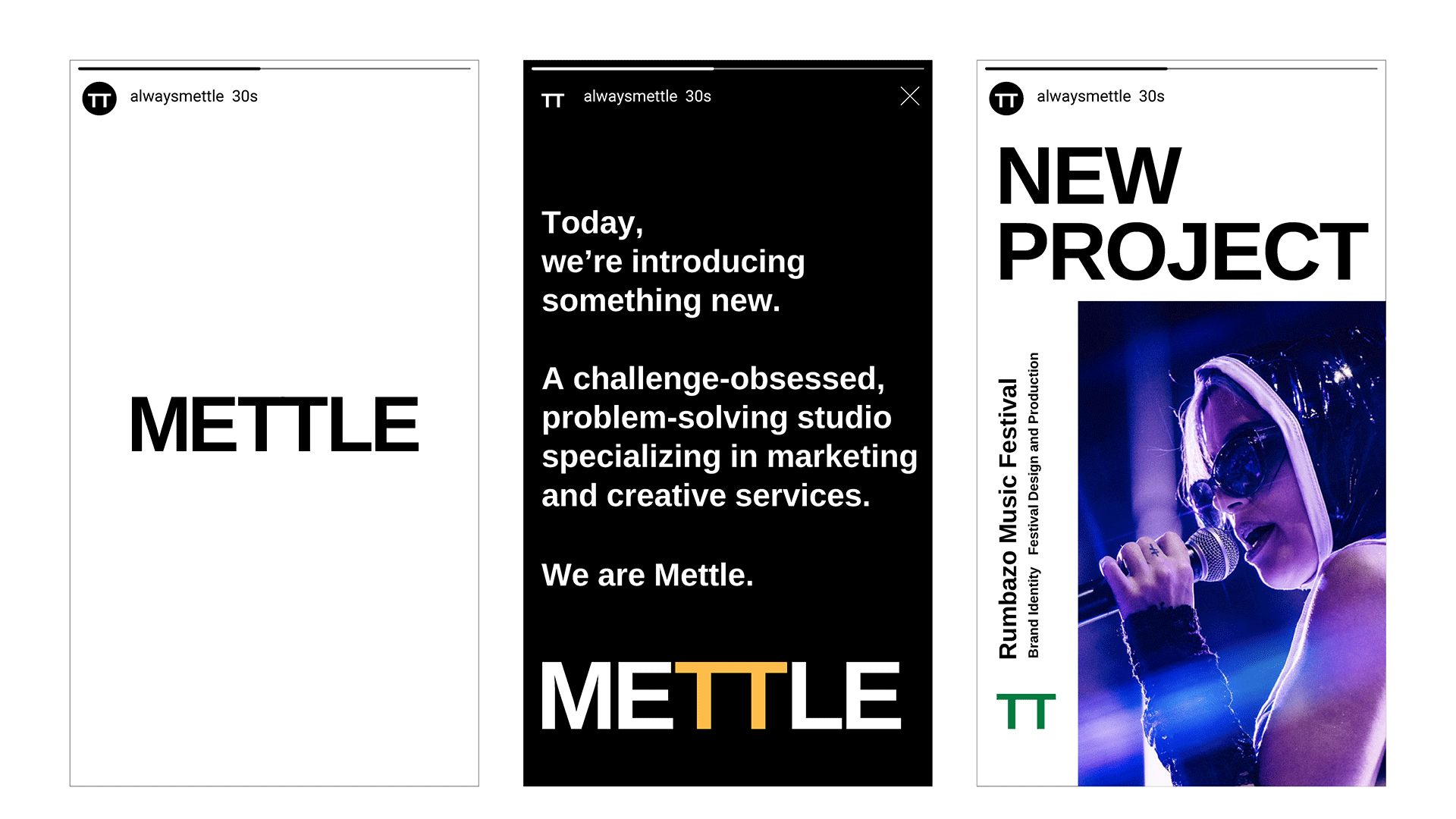
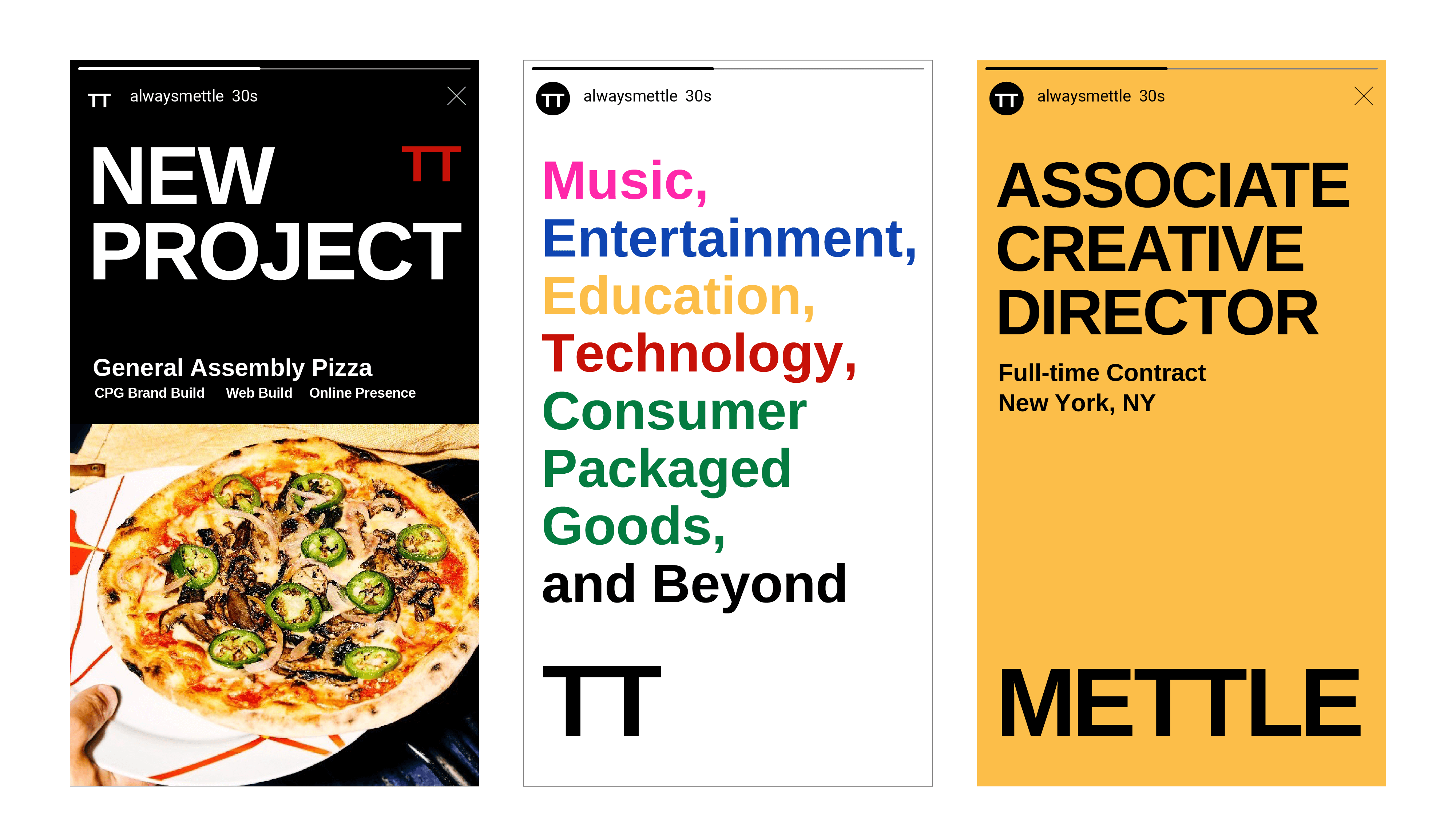
Brand identity for Mettle, a problem-solving studio specializing in marketing and creative services.
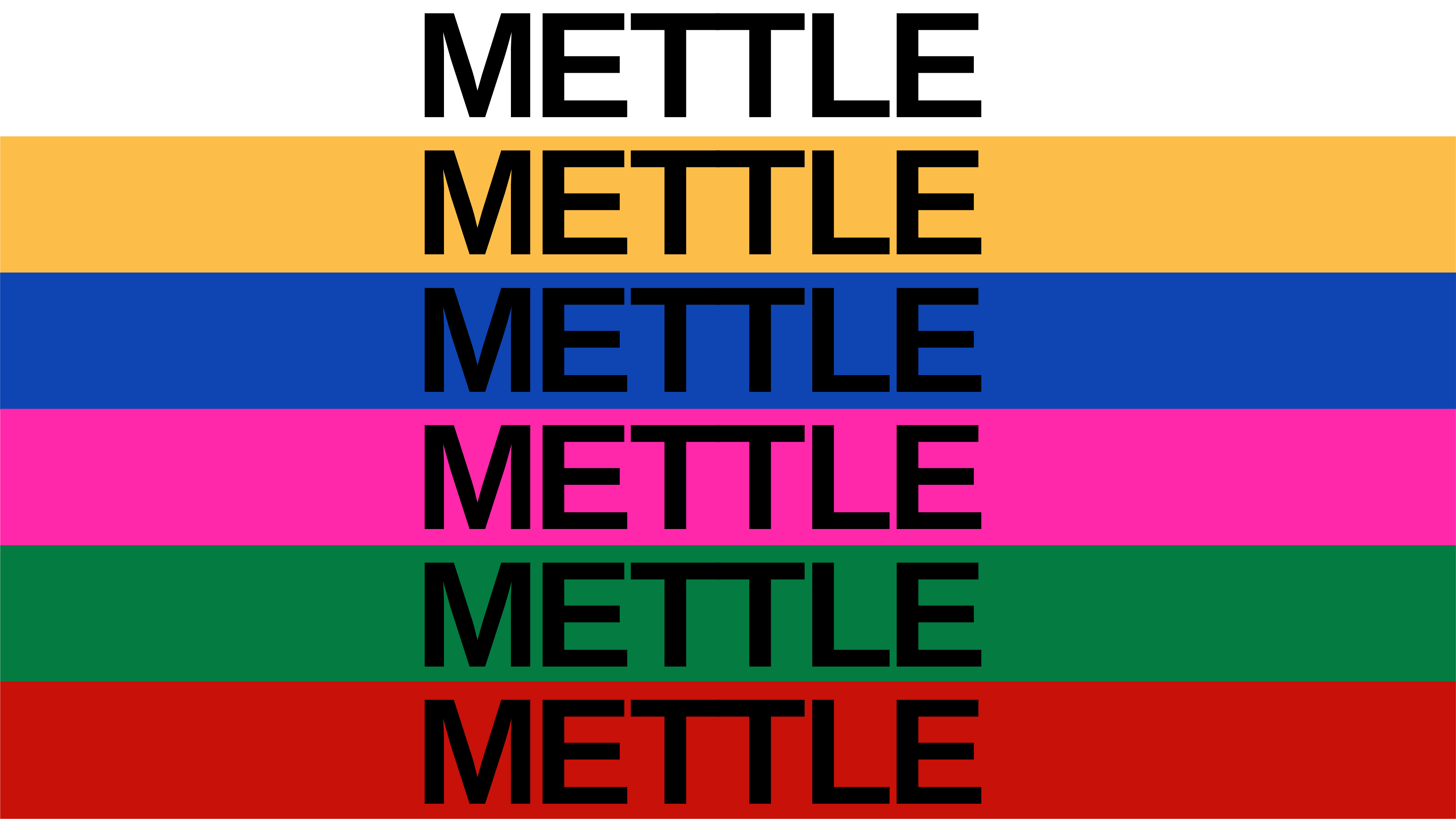
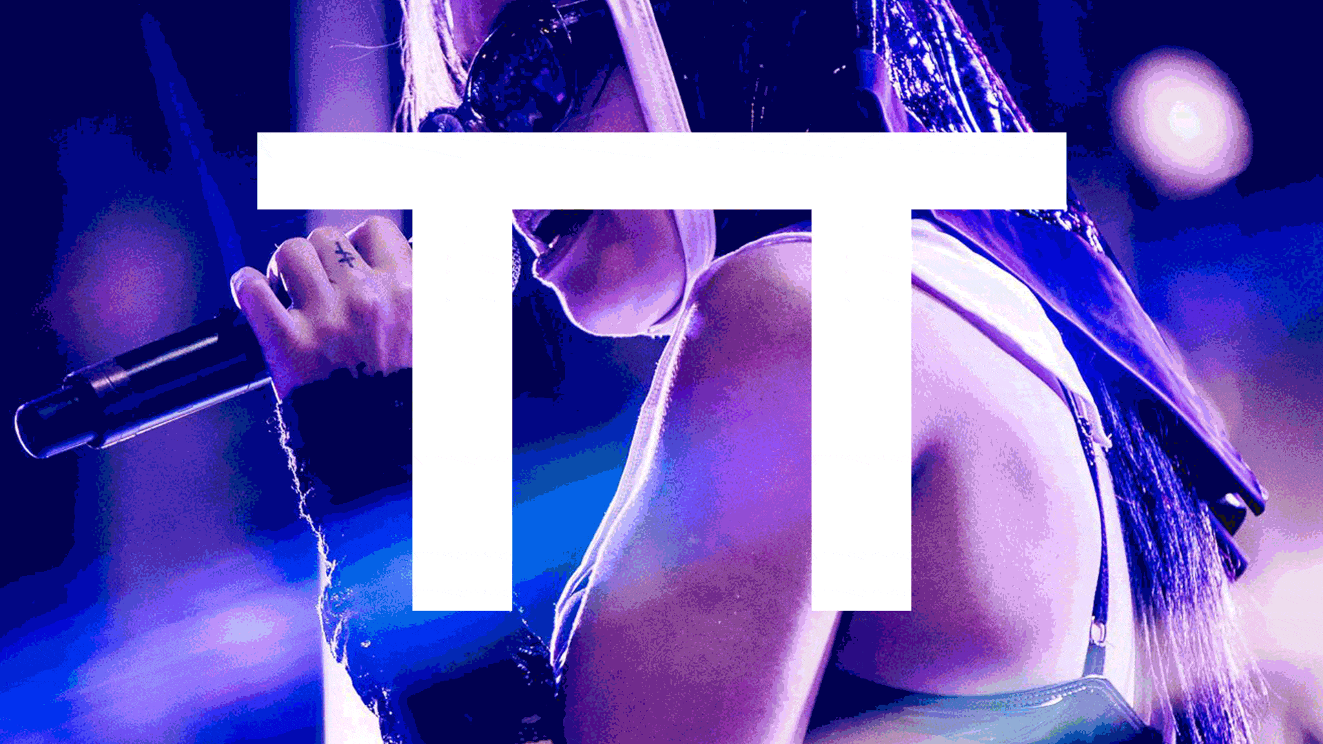
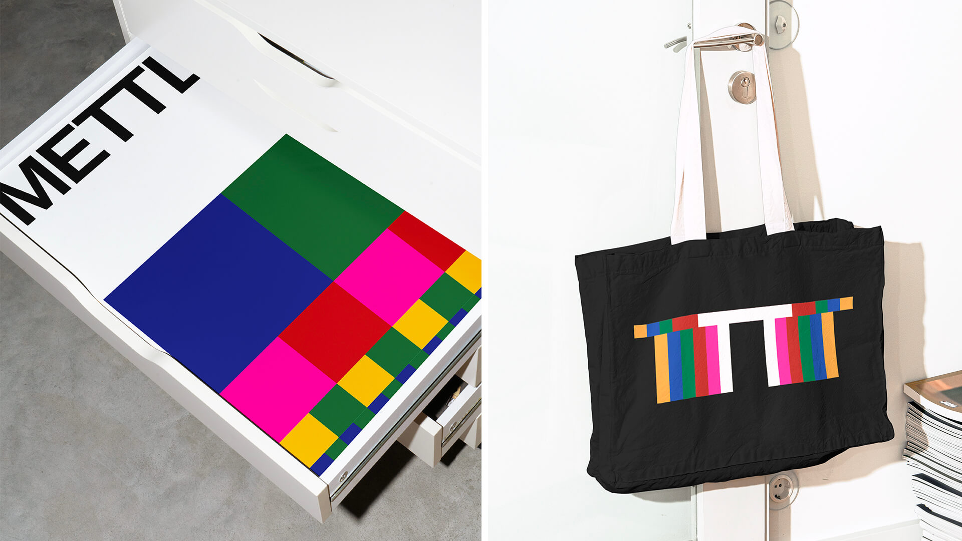
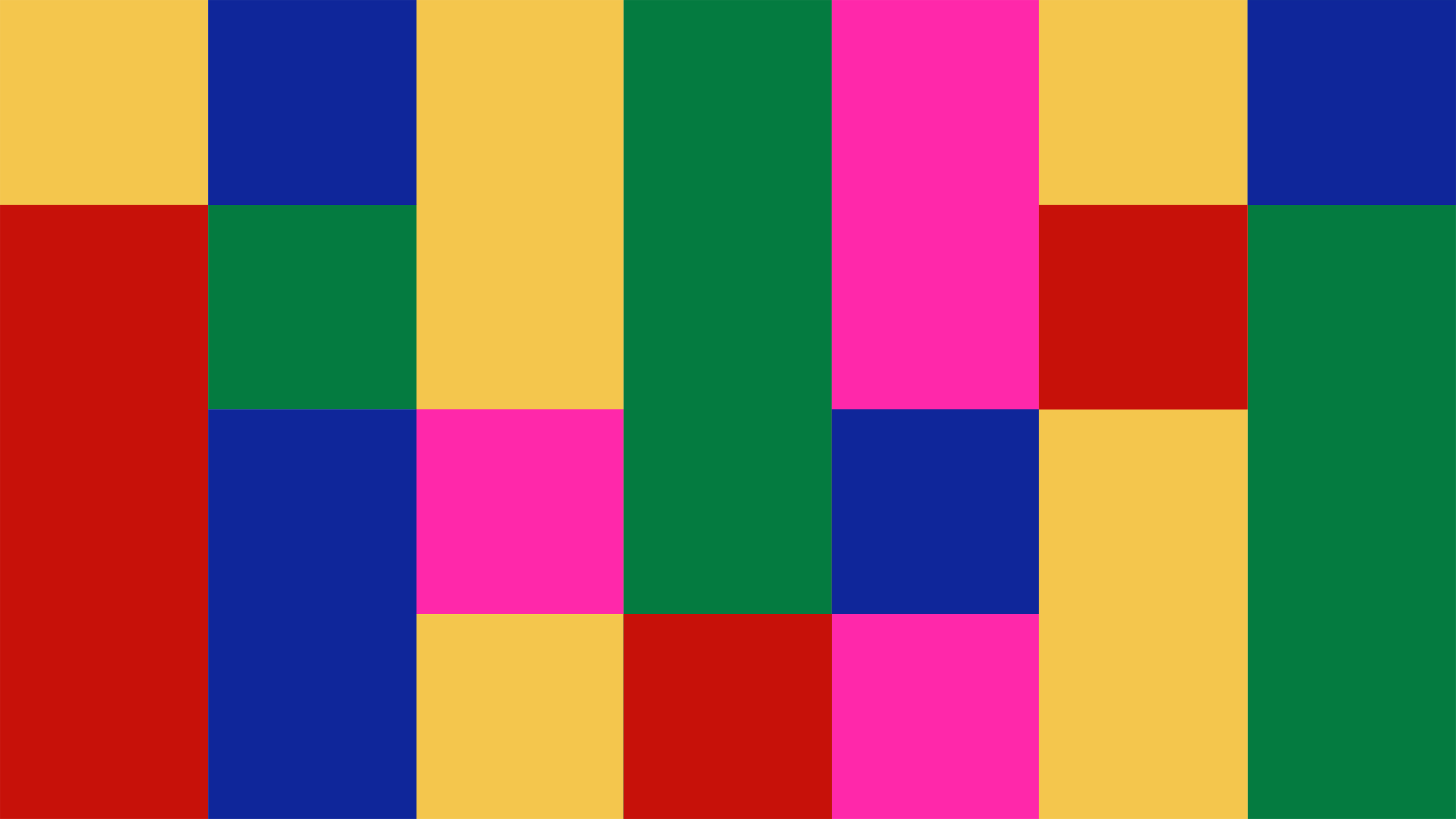
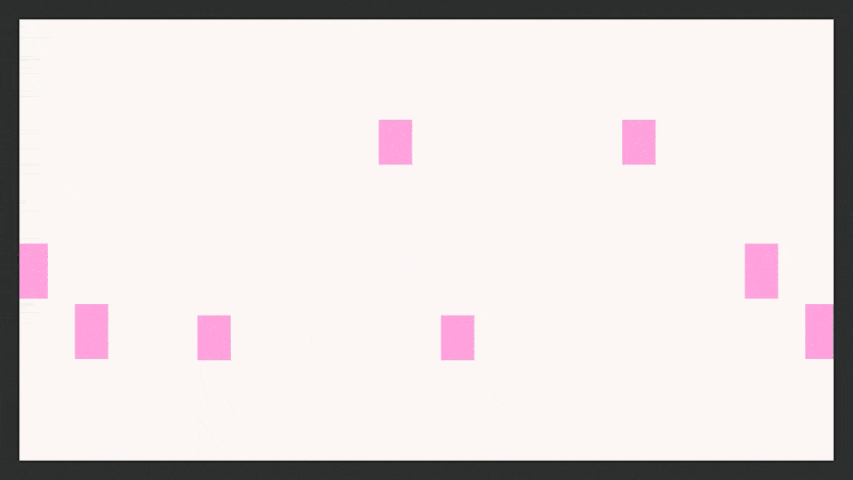
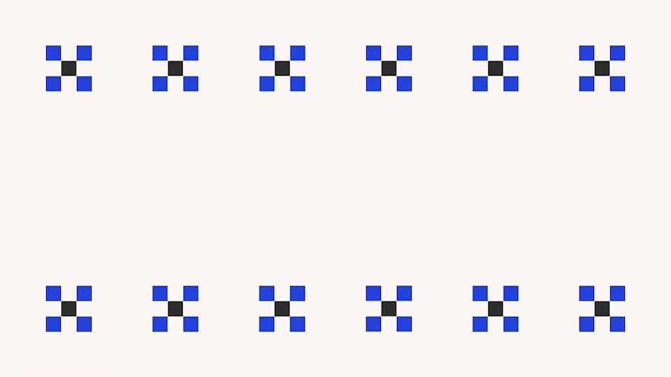
A minimalist type-driven design system with modular, adaptable and, scalable interlocking pieces, speaks to the diverse culture and clients that Mettle represents.
While the brand is anchored in black and white, the color palette is inspired by the colors found in Chinatown where the studio is located. As such, there’s extensive use of almost primary colors complemented by a saturated hot pink.
︎ Credits:
Design: Bárbara Abbês and Eduardo Palma
Typeface: Ramabhadra
Design: Bárbara Abbês and Eduardo Palma
Typeface: Ramabhadra
Hungry for More


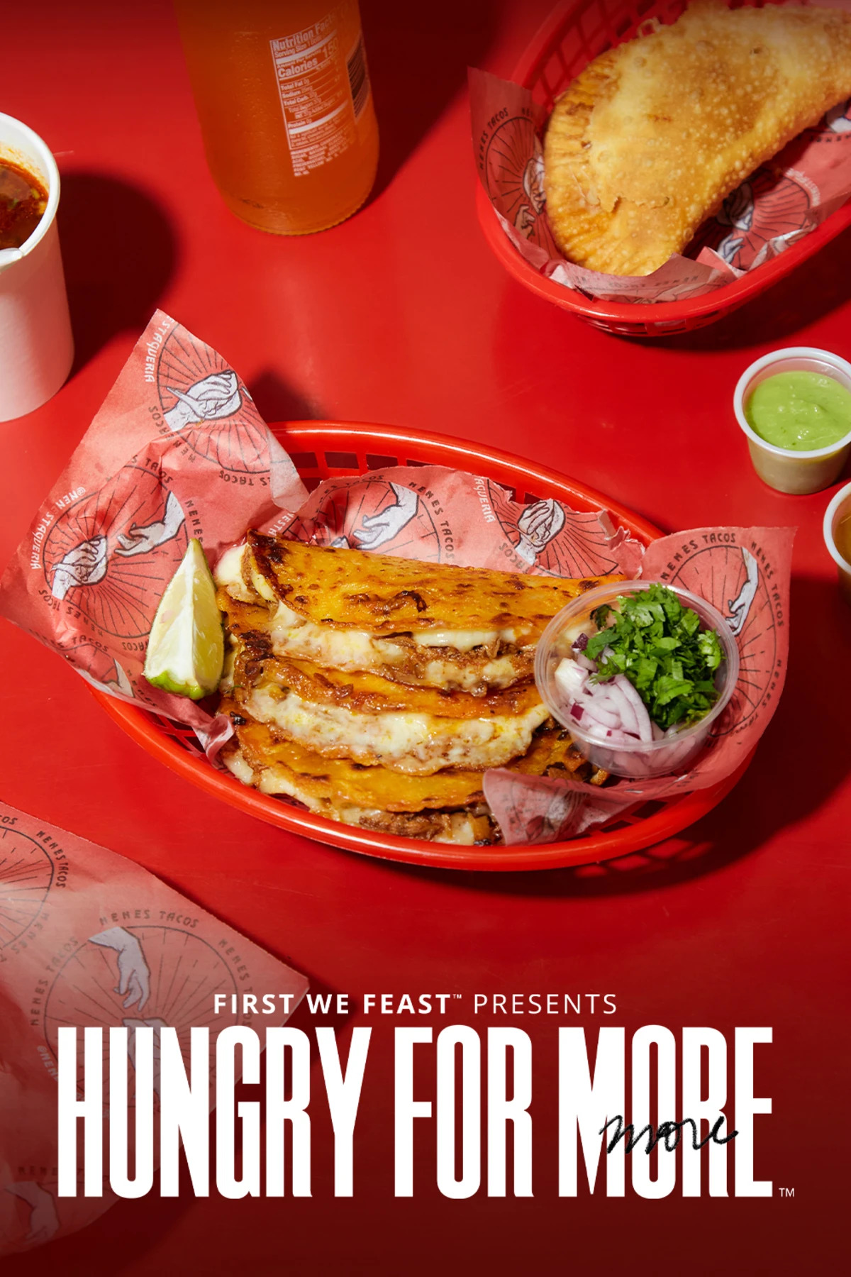
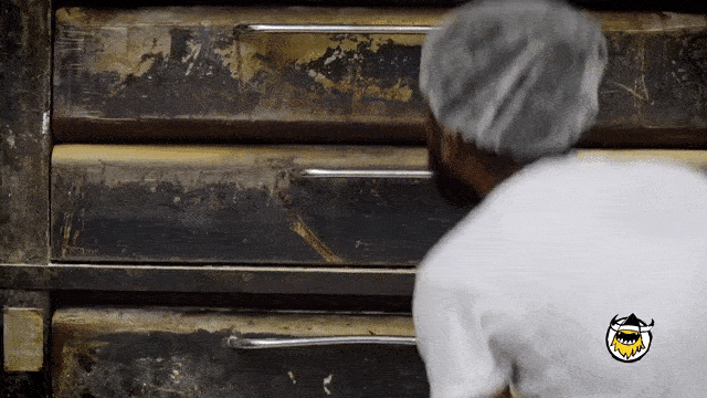

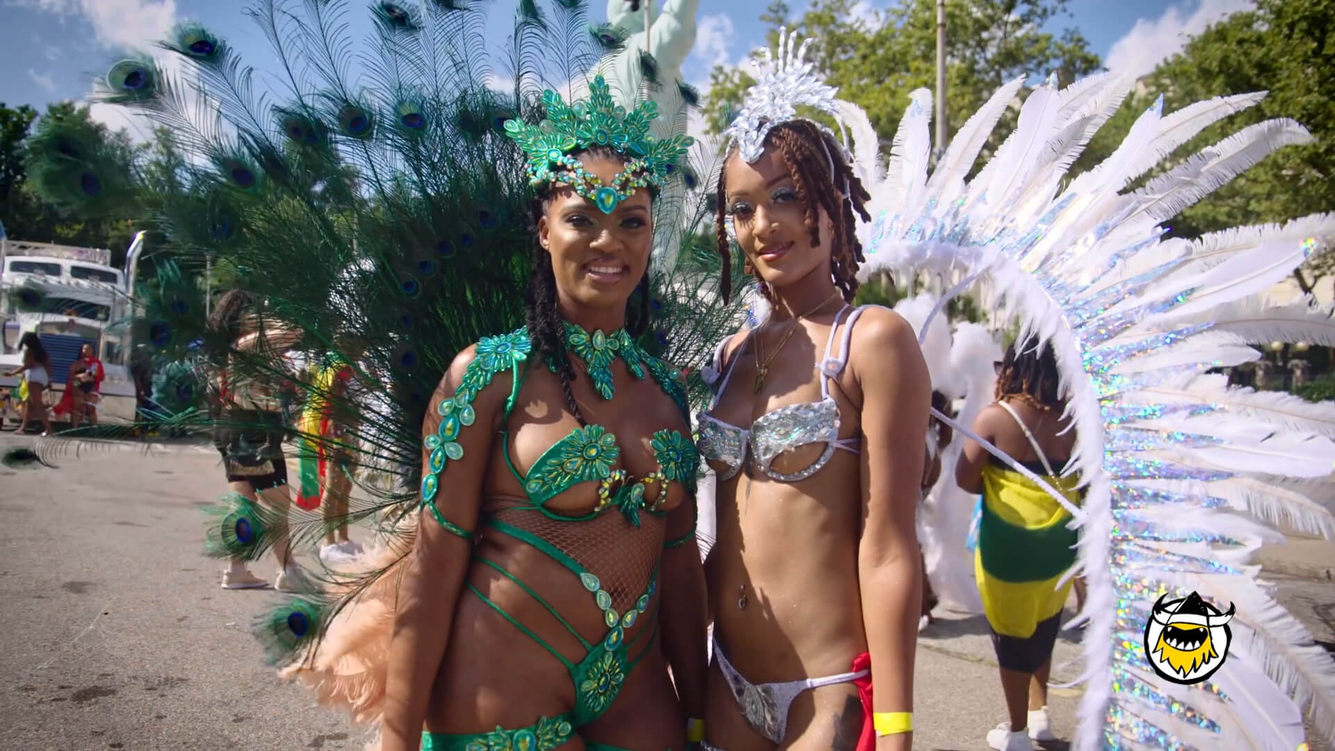
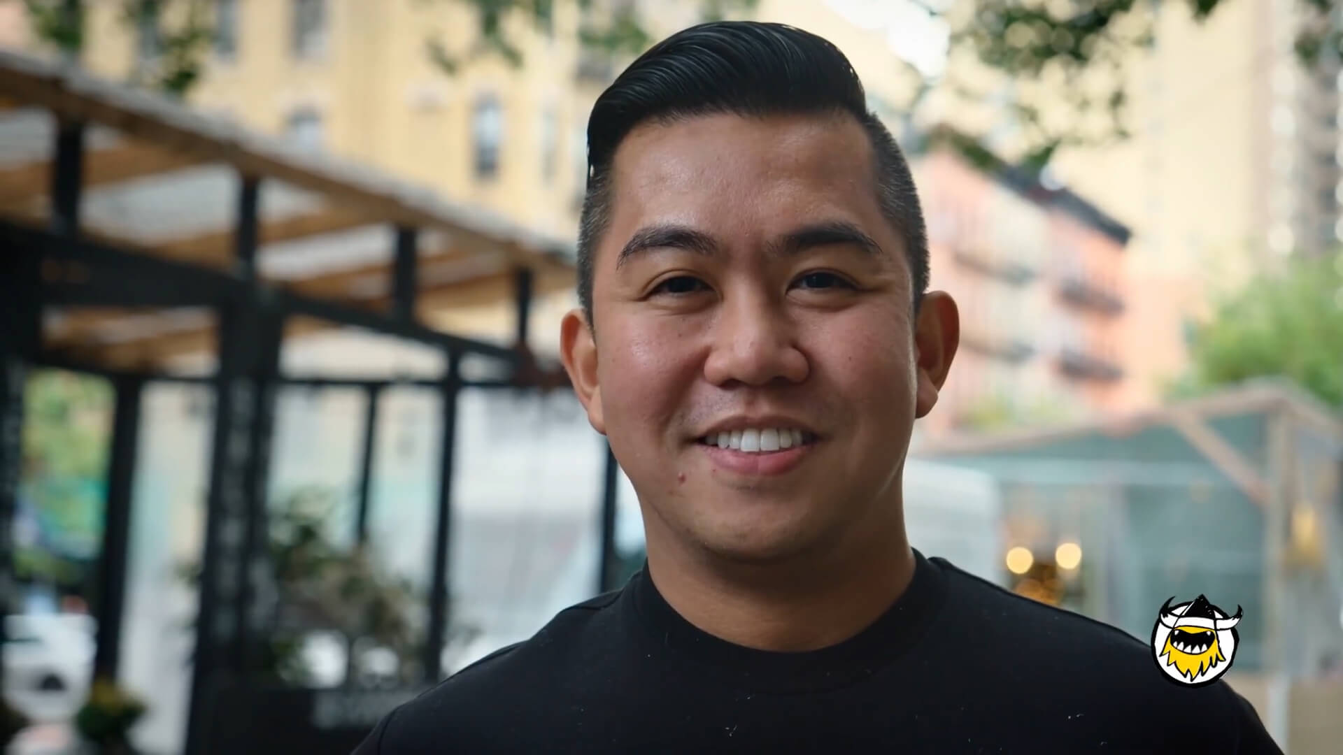

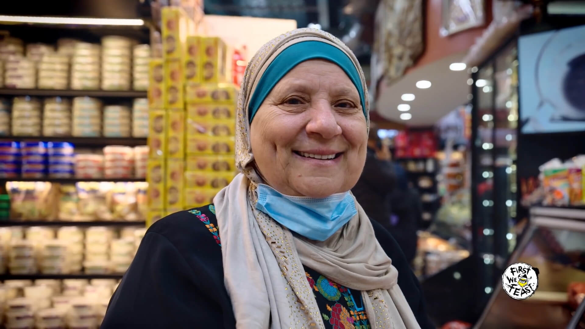
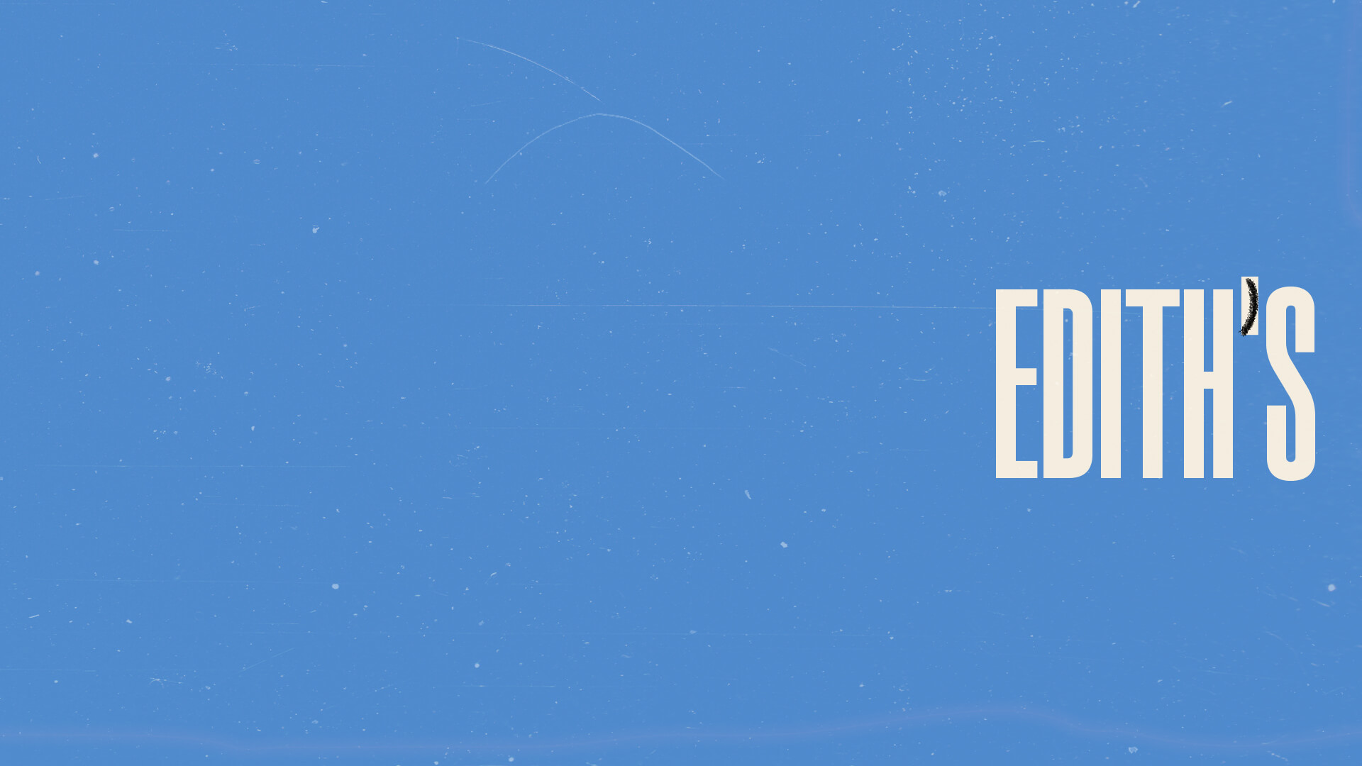
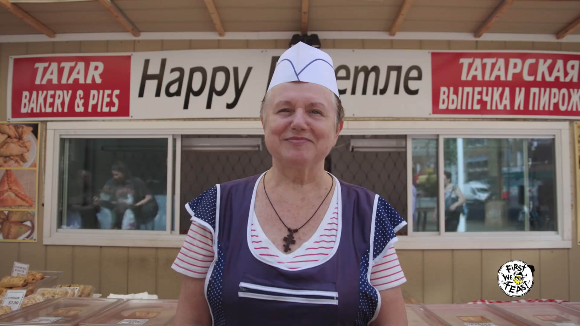
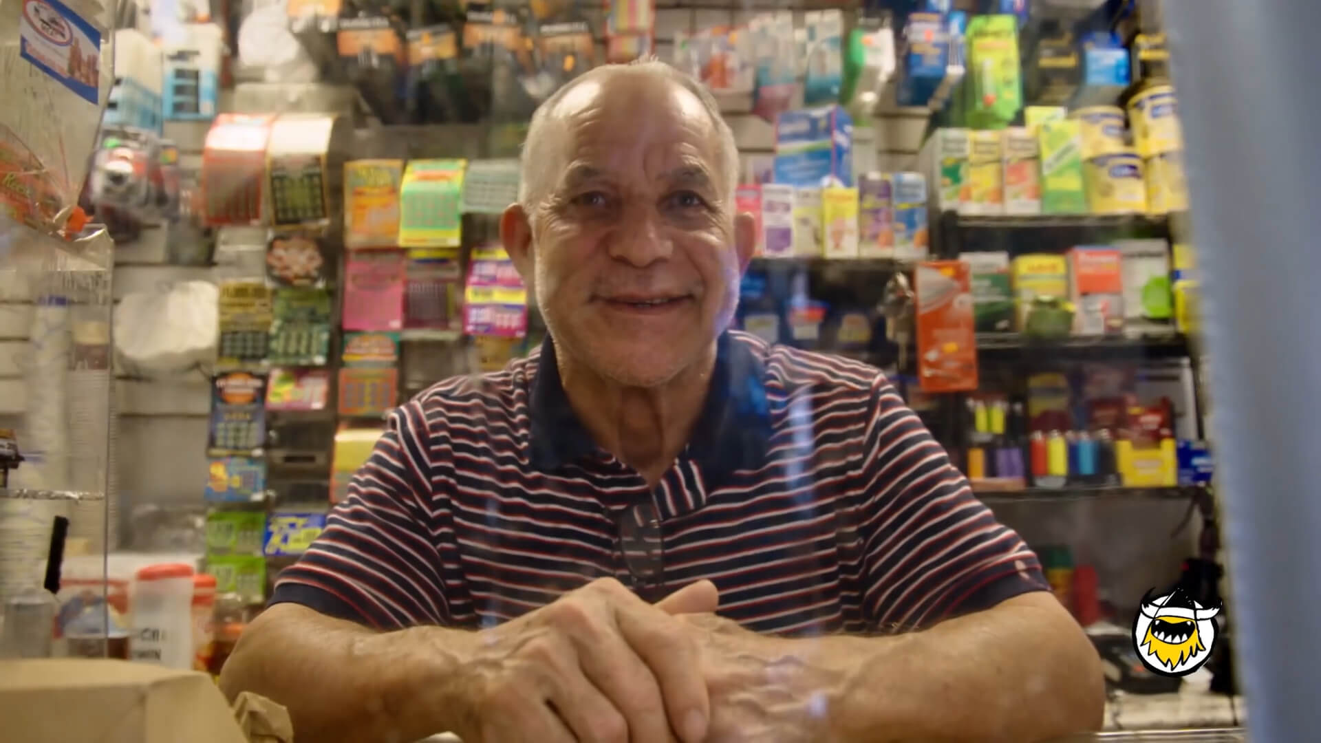
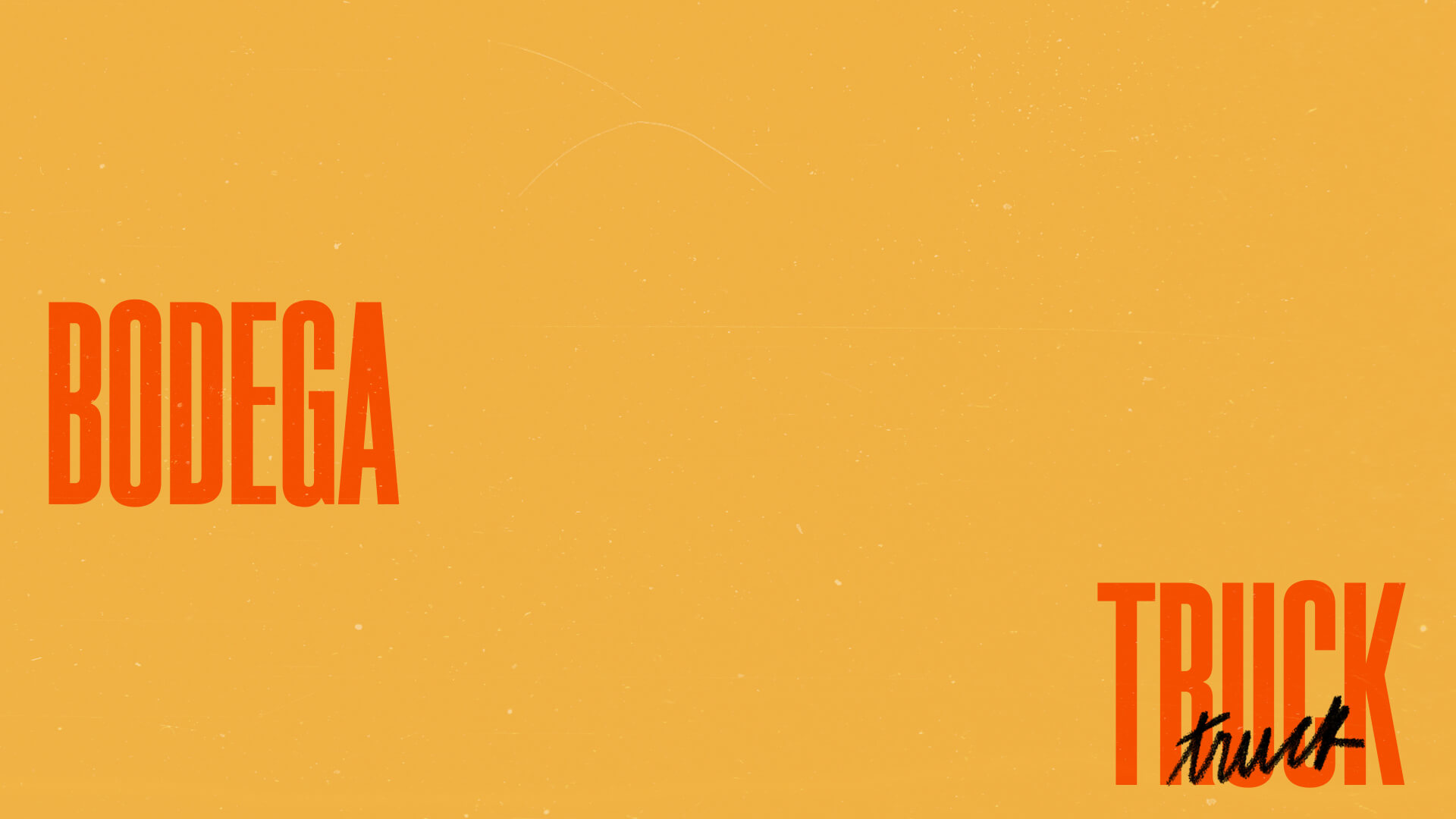
Titles, on-screen graphics, and identity for Hungry for More, a First We Feast documentary series.
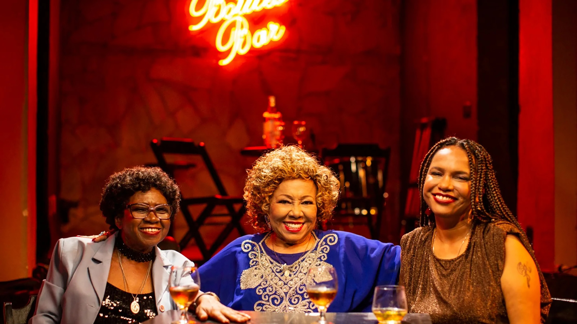
Hungry for More chronicles the stories of chefs, home cooks, and entrepreneurs that represent the new vanguard of the food world—hustlers who have carved out their own lanes – all while bringing comfort to their communities and beyond.
This show is all about food, community and, place and not restaurants as a business. As such the visuals needed to feel familiar like eating a plate of comfort food or watching a Super 8 home movie of yourself.
︎ Credits:
Executive Creative Directors: Ryan Dunn and Wyeth Hansen
Associate Creative Director: Gina Batlle
Art Director: Warren Cochrane
Designer: Bárbara Abbês
Motion Designer: Dan Macnamara
Creative Operations: Bitna Kim
Photos and Videos: Complex
Typefaces: ES Nein and Caslon Doric
Executive Creative Directors: Ryan Dunn and Wyeth Hansen
Associate Creative Director: Gina Batlle
Art Director: Warren Cochrane
Designer: Bárbara Abbês
Motion Designer: Dan Macnamara
Creative Operations: Bitna Kim
Photos and Videos: Complex
Typefaces: ES Nein and Caslon Doric
Never Too Late Basketball


Brand identity for Never Too Late.
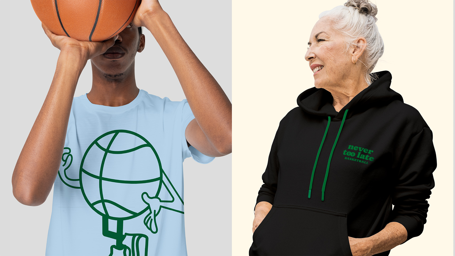
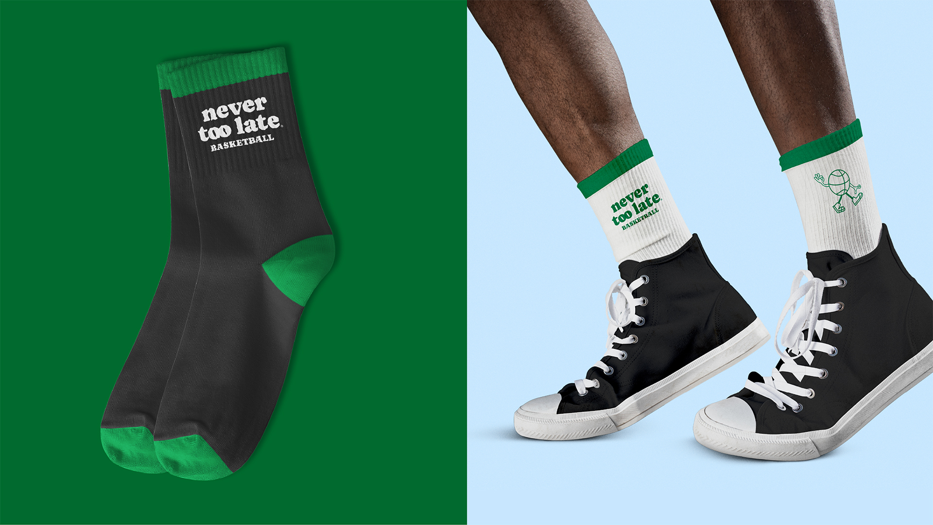
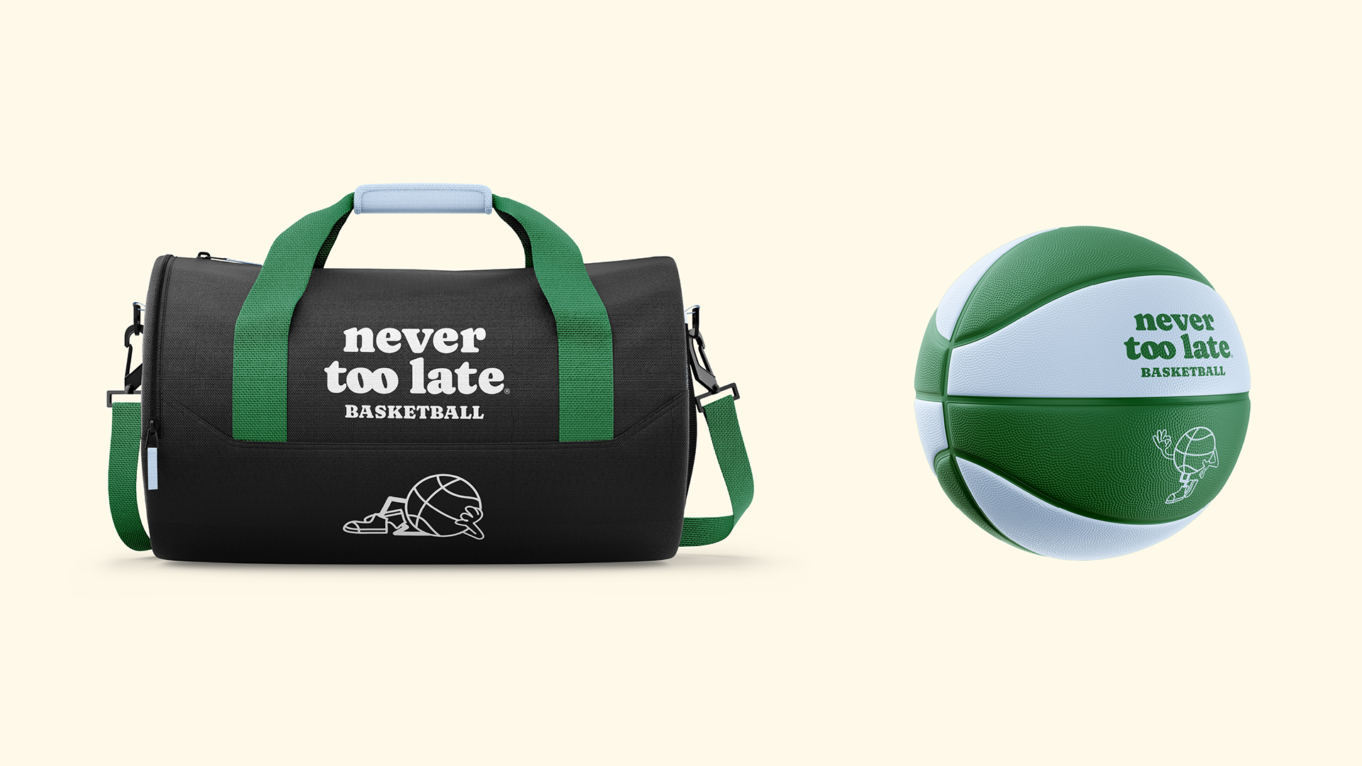
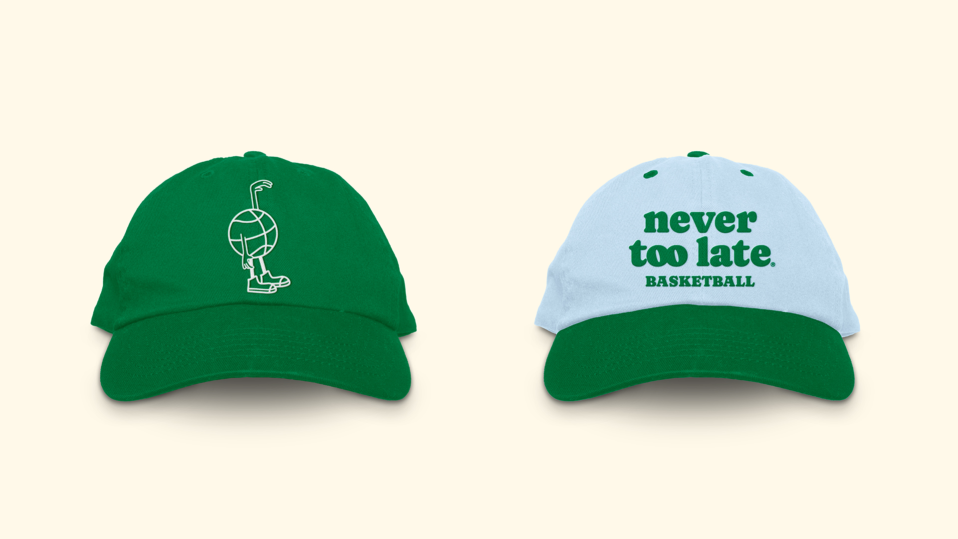
Never Too Late provides high-quality basketball training, instruction, and guidance for adults. Founded over 30 years ago NTL Basketball offers a competitive but collegial environment where people can hone and improve their hooping skills.
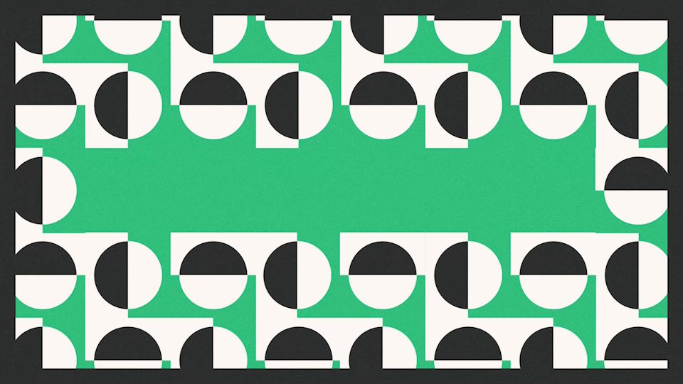
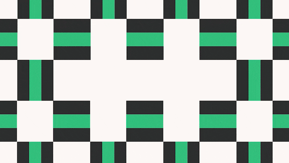
So much of sports related branding is about strength and speed. But what makes NTL truly unique is its balanced mix of competitiveness with a supportive environment.
This brand refresh steps away from the crowded sports space by bringing warmth and playfulness through its type, color choices and mascot. The mascot adds a subtle retro vibe to a bold but lovable identity. Let’s ball!
Never Too Late provides high-quality basketball training, instruction, and guidance for adults. Founded over 30 years ago NTL Basketball offers a competitive but collegial environment where people can hone and improve their hooping skills.
So much of sports related branding is about strength and speed. But what makes NTL truly unique is its balanced mix of competitiveness with a supportive environment.
This brand refresh steps away from the crowded sports space by bringing warmth and playfulness through its type, color choices and mascot. The mascot adds a subtle retro vibe to a bold but lovable identity. Let’s ball!
︎ Credits:
Design: Bárbara Abbês
Typeface: Caprasimo
Design: Bárbara Abbês
Typeface: Caprasimo
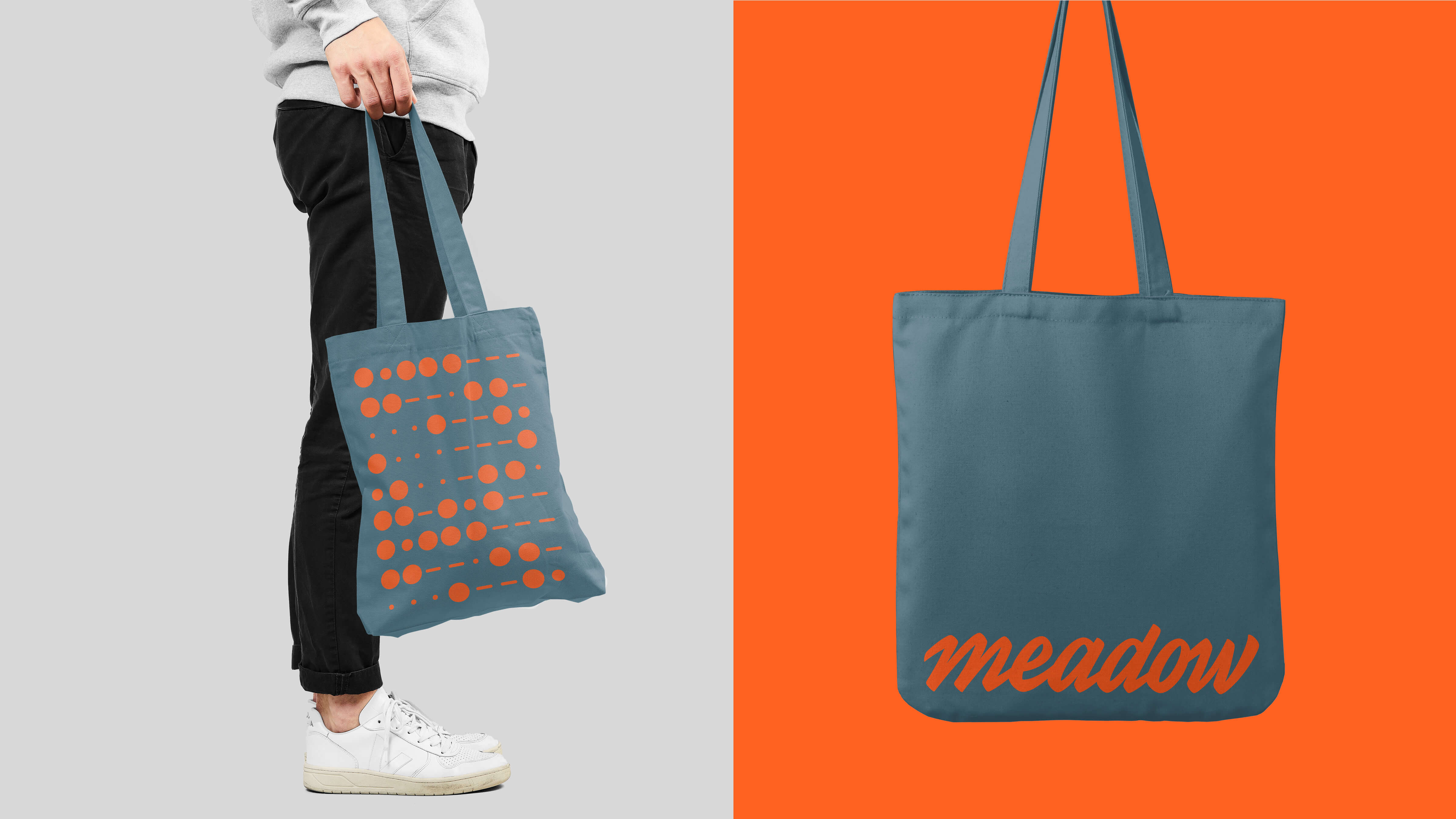
Meadow


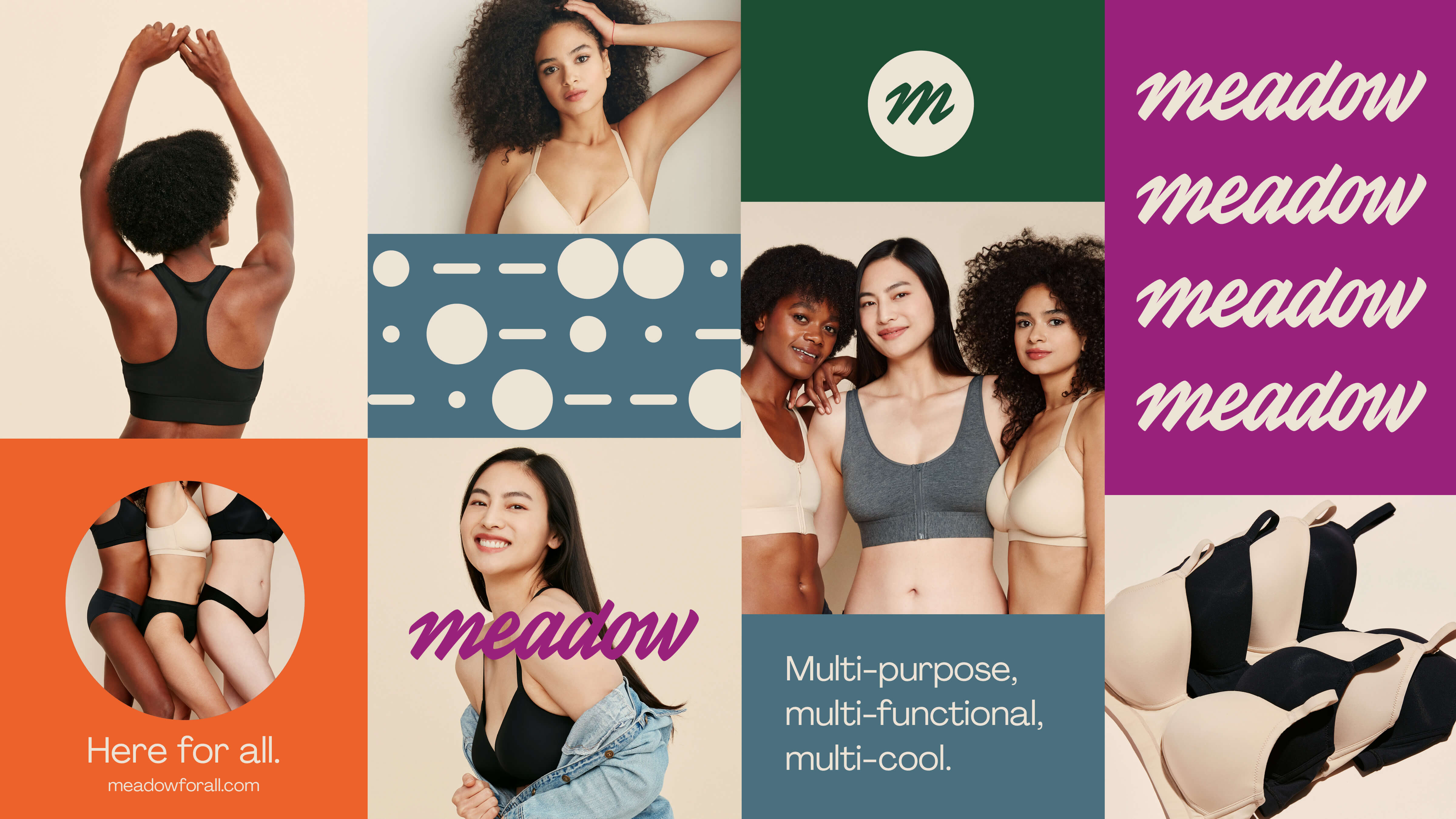

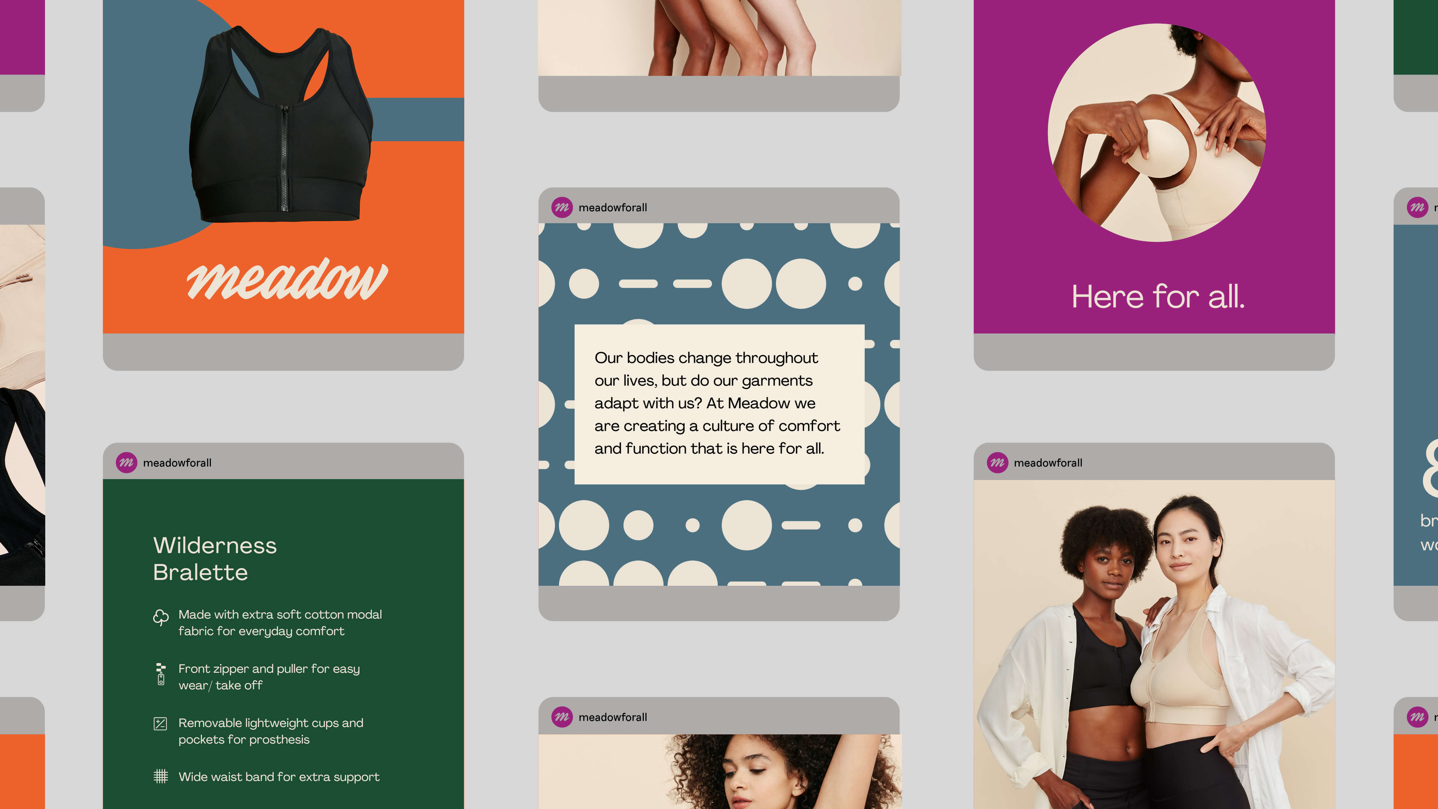

Visual identity, art direction, digital oversight and, collateral design for Meadow, a brand of intimates and loungewear for all bodies.
Meadow exists for a wide spectrum of people across needs. These multitudes are reflected throughout the many brand elements.
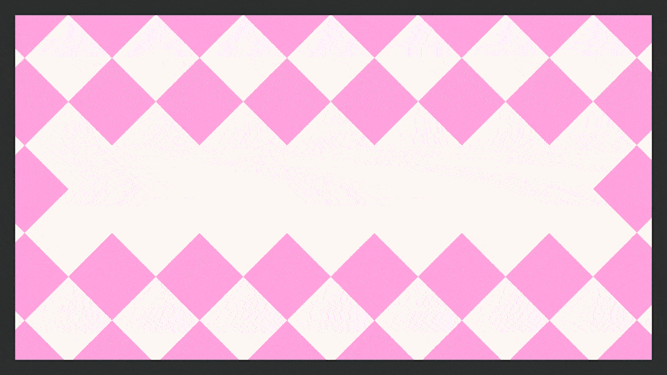
A contemporary spin to the hand-lettered logo reminiscent of lingerie ads and brands of the past is combined with an electric color palette. This combination balances boldness with simplicity and subtle sophistication and helps bring forward the fun and joyful spirit of the brand.
Meadow exists for a wide spectrum of people across needs. These multitudes are reflected throughout the many brand elements.
A contemporary spin to the hand-lettered logo reminiscent of lingerie ads and brands of the past is combined with an electric color palette. This combination balances boldness with simplicity and subtle sophistication and helps bring forward the fun and joyful spirit of the brand.
︎ Credits:
Art Director and Designer: Bárbara Abbês
Lettering Refinements: Flora de Carvalho
Photographs: Katie Thompson
Models: Janelle Anjouli, Kaija Sabbah-Ross and May Cheng
Shopify Development: Liana Shapiro / LS Digital
Typeface: Agrandir
Art Director and Designer: Bárbara Abbês
Lettering Refinements: Flora de Carvalho
Photographs: Katie Thompson
Models: Janelle Anjouli, Kaija Sabbah-Ross and May Cheng
Shopify Development: Liana Shapiro / LS Digital
Typeface: Agrandir
Nos Bares da Vida
![]()
![]()
![]()
![]()
![]()
![]()
![]()
![]()
![]()
![]()
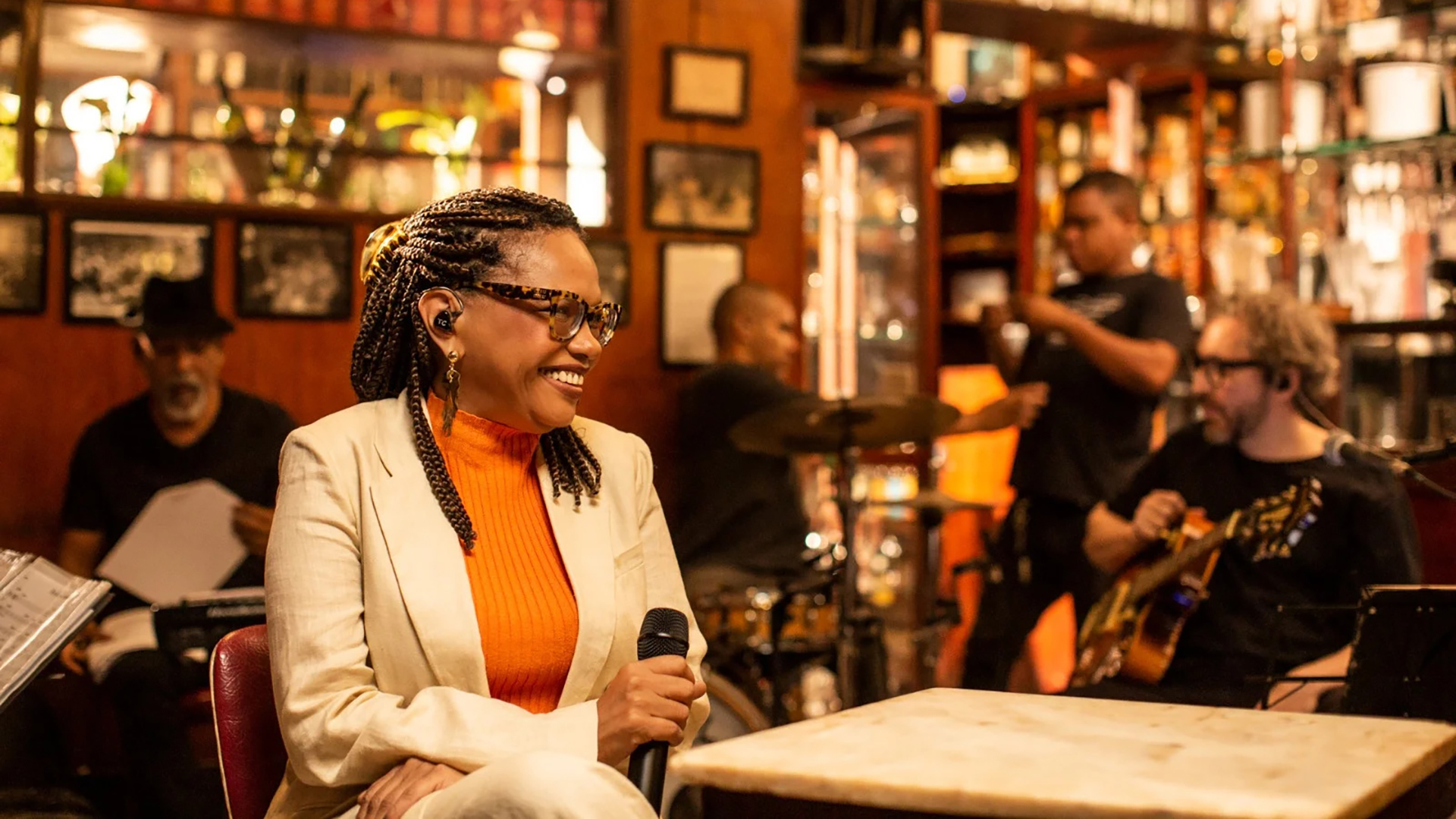

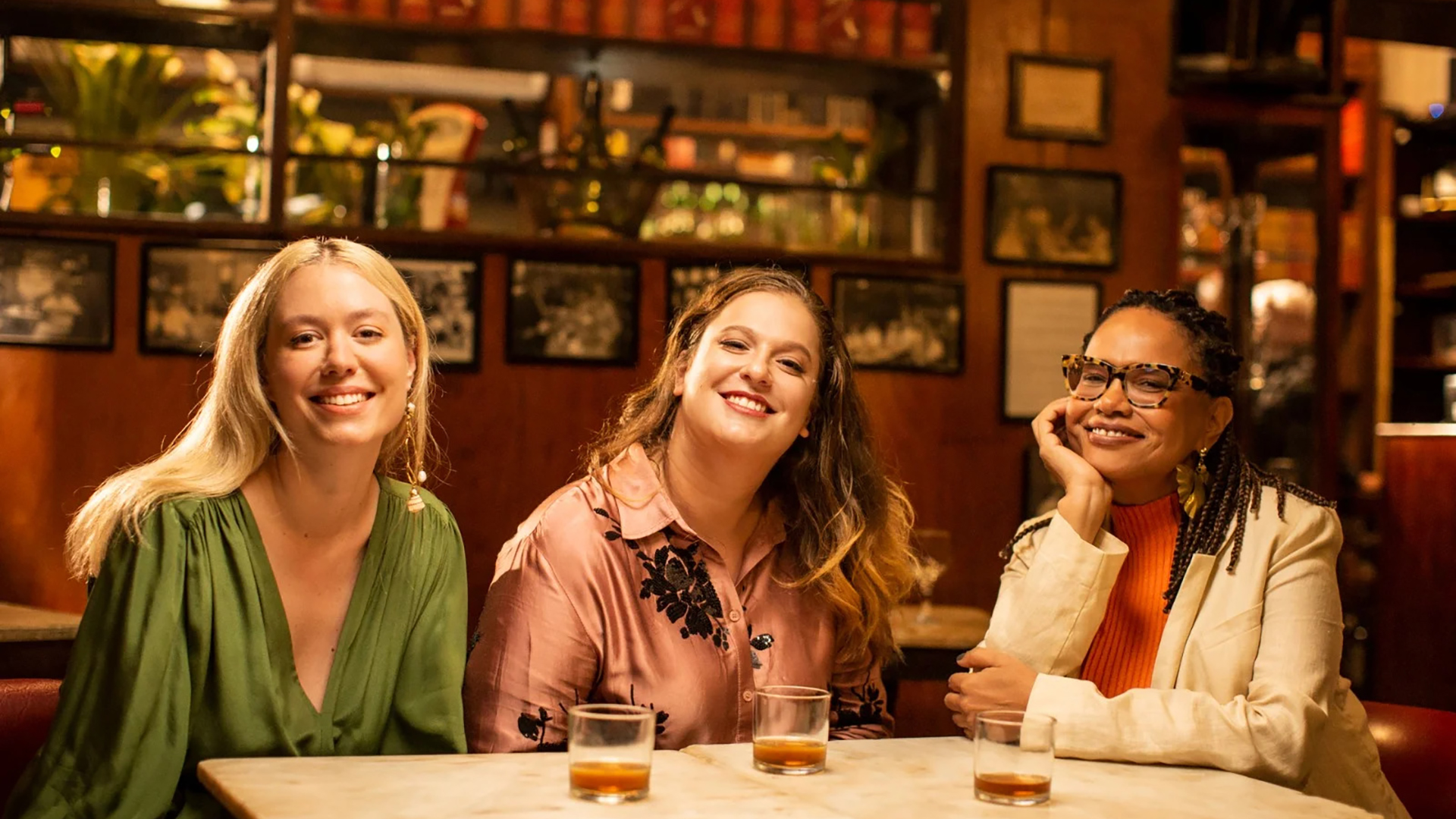
Titles, on-screen graphics, and identity for Nos Bares da Vida, a Globoplay and canal BIS music documentary series.
It’s not enough to have cold beers. The bites, the environment, the owner, and the servers are the soul of the bars and botecos of Rio.
So many classic songs were born within these spaces, where musicians spent nights improvising and keeping the legacy of Brazilian music alive. Nos Bares da Vida investigates the history of several of these notorious establishments in the city through their connections with music.
Hosted by acclaimed singer Teresa Cristina featuring Brazilian icons Alcione, Áurea Martins, Leoni, Léo Jaime, Alice Caymmi, Maria Luiza Jobim, Carlinhos 7 cordas, and Marina Íris.